Lessons in Branding from the World’s Best City Logos
City logos play a crucial role in municipal branding, shaping the identity and perception of a place for residents, visitors, and potential investors alike. A strong logo captures a city's spirit, fosters a sense of pride among its residents, and serves as a powerful tool for marketing and economic development. We’ll explore what makes the best city logos stand out, share successful examples from around the world, and provide practical advice for municipal leaders aiming to elevate their city’s branding efforts.
The Essentials of City Logo Design
Logo design may seem straightforward, but it’s a nuanced process that involves much more than meets the eye. Let’s break down the key components that contribute to an effective logo:
Typeface and Typography: The choice of fonts can convey a city’s character, from sleek and modern to historic and traditional–and the pairings between them. A consistent type palette can make anything a city designs instantly recognizable.
Wordmark: A wordmark logo uses the city’s name as its primary feature, often with creative typographic treatments. In essence, the city's name alone becomes the logo, without a separate illustration or icon.
Tagline: A short, memorable phrase can complement the logo and encapsulate the city’s essence. Not every city needs a tagline, but when used effectively, it can be a creative asset to tie together various initiatives.
Symbols or Icons: These can represent landmarks, cultural motifs, or abstract ideas that embody the city’s identity. These can be used as a core element of the logo, or as supporting images.
Color Palette: Color choices evoke emotions and associations; for instance, blue can represent trust and stability, while green often symbolizes growth and sustainability. A strong color choice in a logo can differentiate a city from every other blue and green municipal logo, and create instant recognizability.
Visual Identity: Beyond the logo itself, a cohesive visual identity ensures consistency across all branding materials. This manifests through photography, illustration, patterns, and more. It brings all of the above elements together into a cohesive whole.
Examples of Key Design Elements
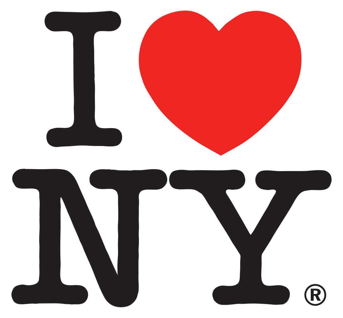
New York City
The iconic “I ♥ NY” logo by Milton Glaser combines a bold wordmark with a universally recognizable heart symbol, creating an enduring visual identity. The design revolutionized municipal branding with its simplicity and emotional resonance. Introduced in 1977, it leveraged a minimalistic approach that left a lasting impression worldwide. Its success lies in its adaptability and universal appeal. Note that in 2023, the logo underwent a redesign that fell flat to New Yorkers and sparked widespread criticism. The updated version replaced the classic typewriter-style font with a more modern sans-serif typeface and changed the heart symbol to a 3D emoji-style heart. Many felt that the redesign lacked the charm and authenticity of the original, which had become deeply ingrained in New York City's cultural identity.
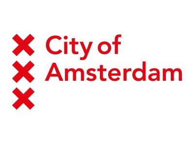
Amsterdam
Amsterdam’s logo stands out for its unique ability to blend history and modernity. At the heart of the logo is the "XXX" motif, derived from the city’s coat of arms, which features three vertical St. Andrew’s crosses. These crosses have been a symbol of Amsterdam since the medieval period and are deeply rooted in its cultural heritage. The city’s modern logo incorporates this historical element in a sleek, minimalistic design that appeals to contemporary audiences while honoring its past.
Case Studies of Successful City Logos

Melbourne
Melbourne’s rebranding effort introduced a dynamic new logo in 2009 with a geometric “M” that serves as a versatile identity system. The vibrant color palette and bold typography reflect the city’s energy and innovation.

Montreal
Montreal’s logo redesign is a celebration of its bilingual and multicultural identity. The design often incorporates the name in both French and English, reflecting the city’s dual linguistic heritage. The logo’s graphic elements draw on Montreal’s vibrant arts scene and its reputation as a cultural epicenter.

Los Angeles
Los Angeles embraced a fresh, creative approach in its rebranding efforts, reflecting its status as a global cultural hub. The primary logo often incorporates bold, modern typography and striking color palettes, representing the city’s energy and innovation.
Chicago
Chicago’s city logo and its iconic flag exemplify how design can reflect a city’s history and pride. The stars represent historical events, while the blue symbolizes the city’s waterways. Its clean and striking design has become a beloved symbol of Chicago. Each city department has a version of the logo that fits seamlessly within the overarching design framework, maintaining consistency and unity.

Porto
Porto’s logo is a brilliant example of how cultural heritage can inform modern design. At its core, the logo incorporates elements inspired by the city’s iconic azulejos, the traditional white and blue tiles that adorn many buildings in Portugal. These tiles are tied to Porto’s architectural and artistic history, symbolizing craftsmanship and storytelling. The logo features a modular design system, allowing for variations that adapt to different contexts while maintaining a cohesive visual identity.
All Together Client Examples
From smaller municipalities to urban centers, our work demonstrates how thoughtful design can align with a city’s goals and community values.


All Together was brought on as a strategy and design partner to help the City of Park Ridge tell its story through visual and messaging campaigns. We worked with residents, business owners, the Chamber, community organizations and elected officials to rebrand the City and its business districts for residents and visitors alike. We created a unified branding system and an implementation guide that will help the City launch the brand, coordinate with multiple brand ambassadors, and continue to tell its story to different target audiences long into the future.

Logos for each of the 10 Evanston business districts
Evanston, IL Business Districts
In partnership with the City of Evanston, we helped tell the stories of each of their 10 districts by creating Enjoy Evanston—an umbrella brand that unifies the city’s diverse business districts while highlighting their unique identities. This cohesive branding strategy amplifies local character, strengthens community recognition, and provides a versatile framework for marketing initiatives citywide.


All Together was engaged by the Village of Antioch to create a comprehensive marketing strategy and a family of brands for its entire community. Our work had to point to investment in downtown, the Chain of Lakes as a regional tourism hub, small businesses and industries, and the next generation of people and families that will continue to keep Antioch authentic by nature. Our work included a logo refresh, an updated messaging framework, a destination tourism campaign, and a plan for improved communications throughout the Village for residents and tourists alike.


All Together partnered with the Village of Lemont to craft a fresh, dynamic complement to the existing Village brand. The result was “Lemont Downtown”—a modern, vibrant identity designed to capture the energy, charm, and appeal of the Village's downtown. The brand celebrates the unique character while appealing to residents and visitors seeking a lively, authentic experience.
The Process of Rebranding a City
Rebranding a city is a comprehensive effort that goes beyond designing a logo. Here are the key steps:
Discovery Phase: Engage stakeholders, conduct surveys, and define the city’s unique attributes.
Design Development: Collaborate with graphic designers to craft a new logo that resonates.
Testing: Solicit feedback from stakeholders to refine the design.

Example: Park Ridge icon design iterations
4. Implementation: Update all brand assets, including signage, business cards, websites, and social media.
5. Promotion: Launch the new brand with events, campaigns, and swag like t-shirts, hats, tote bags, stickers, and other fun, branded items to build excitement and brand ambassadors.
Example: Swag


Practical Tips for Municipal Leaders
Collaborate with Designers: As much as we value the contributions of our youth, this is not the time for a high school design competition. Working with experienced designers ensures a new logo represents a shared understanding of your city’s values and vision in a professional and adaptable design. Provide clear feedback and be open to creative interpretations.
Consistency is Key: To reinforce brand recognition and trust, apply the logo consistently across all platforms, including social media, websites, printed materials, signage, and swag. A strong style guide is key to ensuring a brand is implemented successfully and creatively.
Engage the Community in the Rollout: Your residents are your best brand ambassadors. As your brand is being updated, design programs and events that celebrate the community and disseminate branded swag and messaging.
Beyond the Logo—Building a Comprehensive Brand Strategy
A city’s logo is just one part of its branding puzzle. Here’s how to integrate it into a broader brand strategy:
Personality and Messaging: Developing a clear understanding of a city’s personality guides the rest of brand development. Strong messaging provides the language key stakeholders and brand ambassadors need to tell a consistent story about what makes a city unique.
Identity Systems: Develop a cohesive visual language, including fonts, color palettes, and imagery.
Place-Based Branding: Use placemaking initiatives and community engagement to reinforce the city’s identity.
Content Development: Craft compelling narratives and multimedia campaigns highlighting the city’s unique culture, history, and opportunities. Content should tell a story that resonates with residents and visitors, fostering a sense of pride and connection.
Economic Development: Align branding with real estate marketing and tourism campaigns to attract businesses and visitors.
Frequently Asked Question
-
Depending on the scope, a city branding project can take anywhere from 6 months to 2 years.
-
Costs vary widely, but a professional logo redesign for a city can range from $50,000 to over $500,000, depending on complexity and scale.
-
Yes, we offer logo design services! Our team specializes in creating unique, memorable identity systems that align with your community’s history and values. Whether you're starting from scratch or looking to refresh an existing logo, we can work with you to design a logo that resonates with your audience and stands the test of time. Get in touch with us to start your logo design journey!